Dot Density Map
In this map of China, a single dot represents 50,000 individuals. This is effectively used to show the distribution of China's 1,338,300,000 individuals. From this map, we can see that the central plain and eastern coast is where population is most dense.

Choropleth Map
This map thematically represents the percentage of a country's population with either type 1 or 2 diabetes. Using a yellow (lowest %) to red (highest %) color ramp, we can quickly determine how other countries compare to the US.

Proportion Symbols Map
This map uses relative land area size to depict the proportion of all people over the age of 15 living with diabetes.

Topographic Map
In this map of Stowe, Vermont, the physical terrain (e.g. elevation, territories, rivers, lakes, etc.) of the city is emphasized with the use of dark contour lines against lighter earth tones as well as the use of blue to represent water.
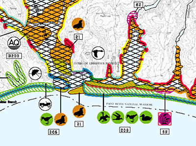
Environmental Sensitivity Index map
This map shows part of the Point Reyes National Seashore. Color codes are used to show ecological sensitivity to petroleum releases. We can see that areas along the coast highlighted with red are especially susceptible to petroleum contamination. In addition, the symbols of wildlife represent areas of concern in regard to breeding/nesting grounds whereas AQ represents aquaculture and an umbrella represents recreational areas.
No comments:
Post a Comment